Here’s What the Ideal Checkout Experience Looks Like
By
|
Last updated on
Most online businesses spend their time and money optimizing the front end of their website – their services, products, and information pages.
They wrongly assume that customers who reach their checkout pages have committed to making a purchase, so there’s no need to test, optimize, or improve those pages.
But your checkout experience (the entire process of making a purchase) is a critical part of your business, so those pages are worth of thought and care.
So what goes into a checkout experience? There are three parts to a great checkout experience.
Part 1: Checkout Page
Your checkout page is wherever your customers input their payment and shipping information. It’s where they finally take the plunge and decide to send you their money.
Take care when you design this page. Just because the customer lands on it doesn’t mean they’re 100% comfortable making a purchase. They always have the opportunity to back out until they hit the “Purchase” button.
Your checkout requires some basic elements:
- Billing information form
- Shipping information form (if applicable)
- The customer’s order (as a reminder)
- Purchase button
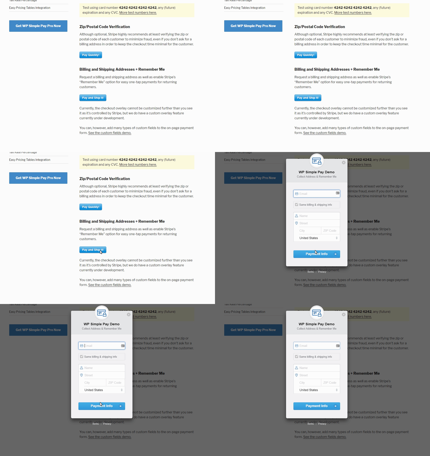
Many businesses don’t require a full ecommerce website with a shopping cart to take payments because they don’t have a lot of products. For instance, a consultant who books one hour phone calls doesn’t need a Shopify or Woocommerce store to take money. He just needs a payment form.
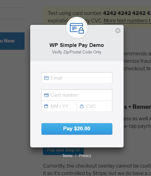
In cases like this, a simple plugin like WP Simple Pay not only facilitates the exchange, it also gives you greater control over your checkout page. This is because any page you install the form button on becomes your checkout page.
In this case, you aren’t bound by a shopping cart’s layout and design. You could put anything you like on the checkout page, like testimonials, reviews, FAQs, etc.
Part 2: Payment Confirmation Page
Your payment confirmation page is the page your customers are redirected to after they make a purchase. It may seem like an unnecessary step, but this page has an important purpose: Validation.
Buying online comes with a certain level of anxiety for your customers because they can’t be completely sure they’ll get what they purchased. On some level, they have to trust that you’re an honest business who will deliver what you promise.
Your payment confirmation page validates the purchase and reassures your customers that they’ve successfully completed the purchasing process. Sure, you could give them a simple success message on the checkout page (“Thanks for submitting your order!”), but a new page feels like the transition they were looking for.
Generally, payment confirmation pages include a big “Thank you” at the top of the page. People like being thanked. It’s not rocket science.
You should also remind them what they purchased. Even though they just bought it, the confirmation makes it clear that you understand your obligations now. If the customer paid for a month’s worth of service, the ball’s now in your court to provide it.
Here are a few more ways to get more value out of your confirmation page:
- Offer upsell, cross-sell, and add-on opportunities. Make it clear that if they buy now, they can get everything delivered in the same box/month/time/way.
- Ask them to sign up for your newsletter or connect with your social media pages.
- Have them add/edit their account details.
- Serve them some useful content to get the most out of their purchase.
- Ask them to complete a survey about their shopping experience.
WP Simple Pay forms redirect to a standard confirmation page, but you can also set your own in the plugin’s settings.
Part 3: Email Receipt (Optional)
While you don’t have to send your customers an email receipt, it’s generally a good idea.
Emailed receipts serve a few purposes:
- They give your customers a record of the transaction.
- They make the customer feel comfortable that they didn’t get scammed.
- They tell the customer what actions or next steps they need to take.
- They create an email-based relationship (so they don’t ignore your email marketing).
- They put pertinent information right in the customer’s inbox.
Instead of thinking about email receipts as necessities, think of them as opportunities. Email receipts have a 71% open rate, which is far higher than the average 17.2% open rate of other email marketing campaigns. This means it’s the one email nearly all of your customers will read.
Email receipts are great places to…
- Request product reviews
- Promote other products
- Promote upsells, cross-sells, or add-ons
- Request customer testimonials
- Offer a discount for future purchases
- Promote your social media accounts
- Have customers share their purchases
- Have customers review your policies
- Explain what your customer should do to use their purchase
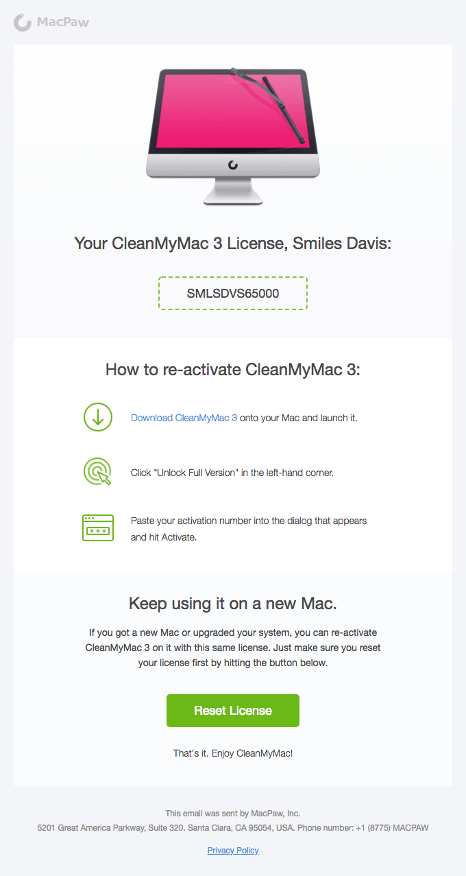
Here’s an example of a great receipt from CleanMyMac 3. It confirms the customer’s purchase and tells them how to use the product.
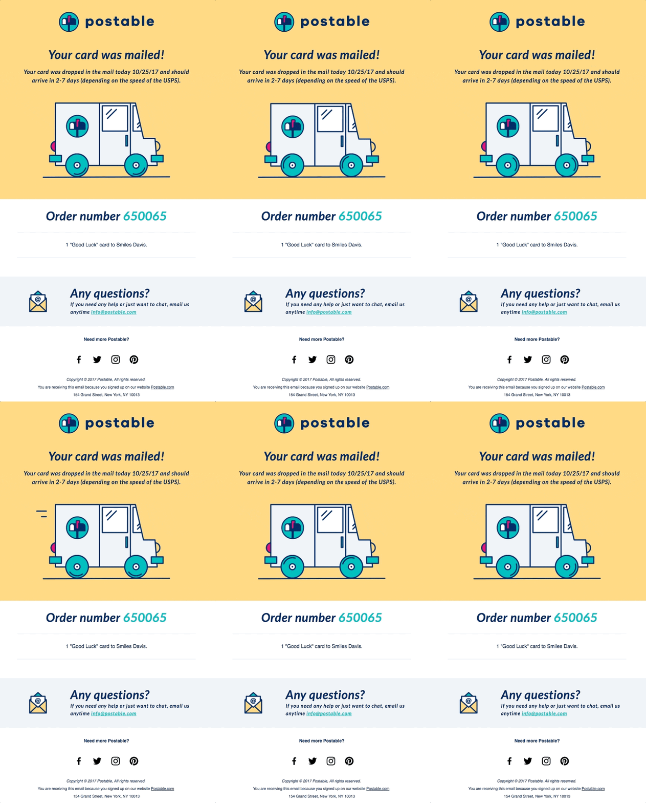
Postable’s email receipt is great too. It gives the customer plenty of information, reminds them what they purchased, and offers a clear way to contact the company if they need help.
If you use WP Simple Pay for your payment forms, email receipts are customized in Stripe. Read this full guide: Configuring Email Receipts in Stripe.
Checkout Experience Best Practices
Here are some best practices to keep in mind as you design your checkout experience.
1. Secure Your Site
SSL certificates reassure your customers that their information is safe. They may not know how SSL certificates work, but they recognize the little lock icon and the word “Secure” in their browser.
Plus, SSL certificates improve your Google rankings, so they’re definitely worth having in place.
2. Keep Customers on the Page
Once your shoppers are on your checkout page (whether it’s a page with a form or an information page with a button that triggers a popup form), it’s important to keep them on that page. Keep any pertinent information nearby so they don’t wander somewhere else.
If you think your shoppers need more information, put that information on the page. Don’t link them to it or they might fail to return to complete their purchase. For instance, you might use expandable accordion dropdowns for your return policy or FAQs.
3. Design for Mobile
When we use a mobile device, we hold them in three basic ways: one-handed, cradled, and two-handed.
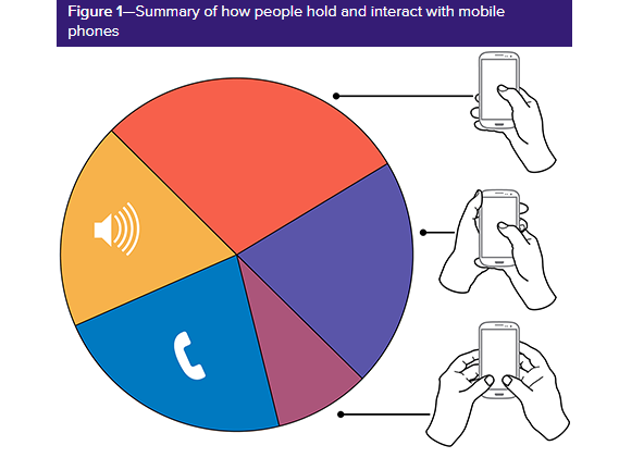
In each case, our thumbs play an important part in screen interaction, so it’s important to design a checkout experience your customers can navigate with their thumbs.
This means your checkout page should be easy to scroll, even when covered by half the keyboard
Furthermore, make your buttons wide. MIT Touch Lab discovered that the average width of an adult thumb is 1 inch (2.5cm), which is about 72 pixels, so your buttons should be at least 50 pixels wide, but full-width is ideal.
4. Avoid Long Checkout Pages
If your checkout process is complex (maybe you need customers to select options, input information, or review offers), it’s best not to put it all on the same page. Long pages are frustrating for users, especially when they use mobile devices because their keyboards take up half the screen.
If your checkout process is long, break it into several pages. End each page with a “Next” button until they reach the final “Place Order” button. This makes the process less intimidating for your customers.
If you can, include a progress indicator at the top of the page to reassure customers that the checkout process isn’t endless.
5. Speed Up the Process
You know that fast pages are important, but they’re especially important at checkout. If checkout pages take longer than three seconds to load, you’ll lose 57% of your shoppers. Mobile users expect checkout pages to load fast or faster than they load on desktop devices.
You can speed up your checkout process by…
- Removing any unnecessary images. If you want to include images of your customers’ products in their cart, use thumbnails, not full size images.
- Remove unnecessary widgets, like carousels, testimonials, reviews, etc. Your checkout page(s) should focus solely on making the purchase.
- Remove any third party scripts that don’t support the checkout experience.
- Install Google’s PageSpeed tools to analyze and optimize your pages.
6. Set Your TabIndex
Customers like to use the TAB button to quick navigate to the next field. This helps complete forms faster. Test your payment and shipping forms to make sure you can TAB through them in a logical way. If you can’t, place an HTML tabindex attribute on the form to force the proper order.
7. Make Input Fields and Labels Large
No one likes squinting to read your page. Make your input fields (the text boxes where they input their information) and those fields’ labels big enough to read on any device – at least 16px.
8. Include Click-to-Call or Live Chat
Sometimes people want to buy but they can’t find answers to their questions on your site. The checkout page is a great spot to place a clickable phone number or a live chat feature so they can get the information they need to make a purchasing decision.
9. Don’t Require an Account
Forcing new shoppers to make an account before completing their purchase is a big barrier for many people. It’s an unenjoyable obstacle between them and their purchase.
Plus, people are concerned about privacy these days. Even though they don’t mind buying from you, they may not want you to track them.
Give your customers a guest checkout option to speed them through the checkout process.
10. Use Persistent Checkouts
Sometimes shoppers like to browse your site at different times or on different devices. It might take them several visits just to decide to make a purchase. Persistent checkout is when customers’ items stay in their shopping cart for a while, even when they leave the website.
Persistent checkout is important if you have a full ecommerce store, but not that relevant if you use a simple payment form like WP Simple Pay that’s good for single or recurring payments.
Going Forward
Your checkout experience is one of the most important interactions your customers will have with your business. When they reach that point, they’ve already overcome a number of obstacles between them and making a purchasing decision. Follow our advice and best practices and you’ll create a checkout experience that maximizes your conversions.
